New Britain Athletics Case Study
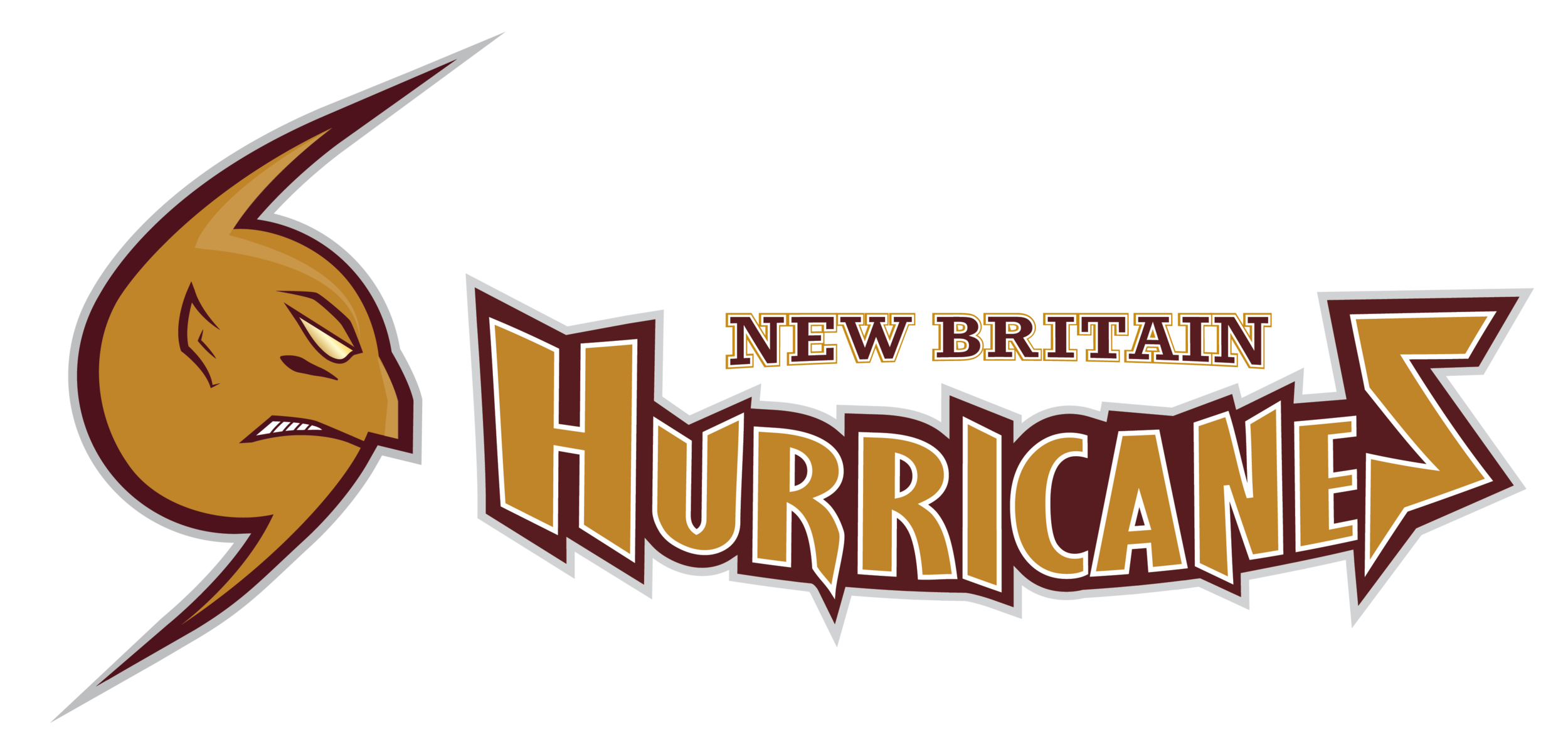
This case study showcases my efforts to revamp the athletic brand of my high school. Upon conducting extensive research, I observed a lack of consistency in New Britain's visual standards. For instance, the NHL Carolina Hurricanes logo was used with maroon and gold colors, while the baseball team wore hats with the NB initials in a serif font. This inconsistency created an unofficial and disjointed look for the school's spirit.
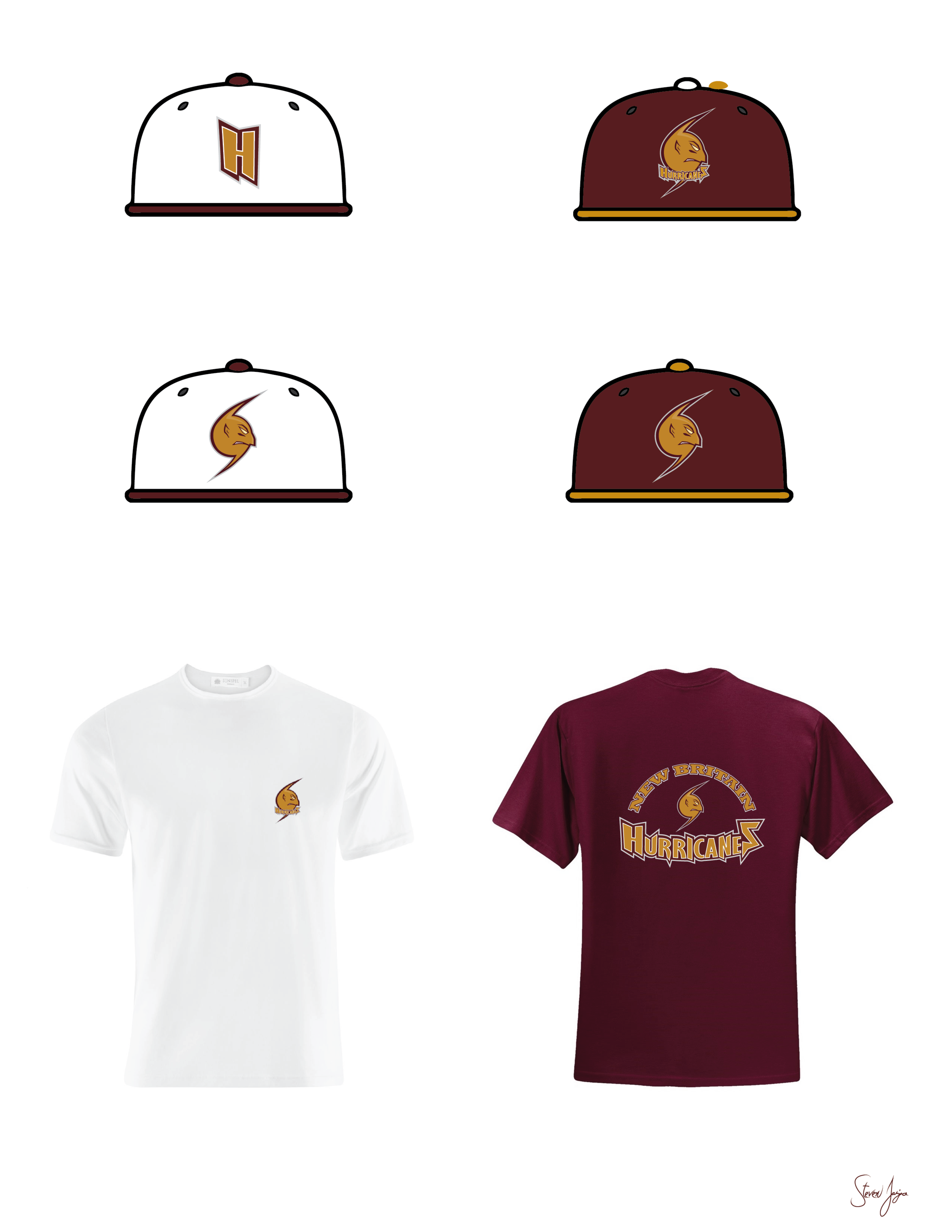
To address this, I created a new logo that embodies the Hard Hittin' spirit of New Britain. The logo resembles a hurricane symbol and exudes toughness. The wordmark is inspired by the Tampa Bay Buccaneers logo and features jagged typography. Additionally, each sport can now have its own distinct logo, as seen in the basketball and football logos showcased below.